
Chapter 13: Theme Layouts Hub
MartX Theme Layouts, Visual Customizer & Frontend Templates Documentation.
13.1 Theme Layout Architecture & One-Click Customizer Engine
MartX provides an enterprise-grade Dynamic Theme Layout Engine that empowers store owners and administrators to completely alter the visual presentation, navigation structure, and product card rendering across the entire storefront in 1 single click — with zero code modification, zero server downtime, and zero template recompilation overhead.
Navigate to: Admin Dashboard → Website & CMS → Theme Layouts.
Visual Selection
Select your desired layout card from any of the 6 dedicated setting tabs.
Live Modal Preview
Click the eye icon on any card to preview the full high-res mockup before saving.
AJAX Persistence
Click "Save Theme Layouts" to persist settings directly into the database.
Instant Storewide Sync
Blade layout resolvers dynamically adapt the storefront in real-time with instant cache busting.
13.2 Tab 1: Dynamic Header Layout Switcher (3 Styles)
The Header is the primary visual anchor of your e-commerce store. MartX features 3 distinct Header Architectures tailored for diverse inventory depths, branding styles, and navigation models.
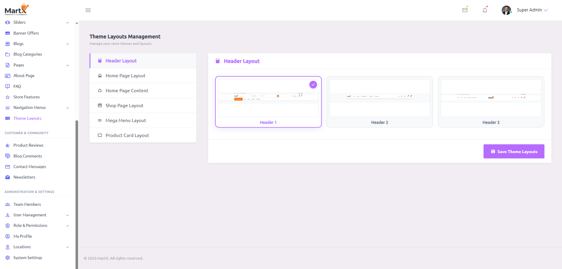
When Header 3 is selected, the Mega Menu Layout tab is automatically disabled in the admin panel and tagged with an N/A badge.
Why? Header 3 utilizes an exclusive Centered-Logo & Side-Drawer (Curtain Menu) navigation pattern. Traditional full-width horizontal flyout mega menus are only designed for Header 1 and Header 2.
Frontend Visual Styles:

Header 1 Architecture Highlights:
- Top Announcement Bar: Displays quick links, localized currency/language selectors, and promotional flash notice.
- Full-Width Search Bar: High-visibility central search box with live product autocomplete suggestions.
- User Account & Modal: Dedicated 1-click user authentication modal trigger, wishlist counter badge, and real-time mini-cart counter.
- Mega Menu Navigation Bar: Clean lower navigation strip with departments dropdown and quick page links.

Header 2 Architecture Highlights:
- Integrated Category Dropdown: Built-in category selector dropdown directly inside the search bar for scoped catalog queries.
- 24/7 Hotline Support Badge: Dedicated customer support phone hotline indicator prominently positioned next to user actions.
- Compact Sticky Header: Slim height footprint optimized for maximum content viewport area on scroll.
- Category Bar: Direct access to primary product classifications.

Header 3 Architecture Highlights:
- Centered Brand Emblem: Symmetrical aesthetic putting the brand identity in prime center focus.
- Split Navigation: Links distributed evenly to the left and right of the central emblem.
- Curtain Drawer Trigger: Hamburger icon triggers an elegant offcanvas curtain navigation menu.
- Boutique Look: Favored by high-end luxury fashion, jewelry, and lifestyle apparel brands.
13.3 Tab 2: Home Page Layout Switcher (2 Styles)
MartX features 2 completely distinct Home Page architectural templates. Switching between Home 1 and Home 2 instantly restructures the entire landing page section order, hero banner layout, and content grouping.


Home 1 Section Architecture:
- Full-width promotional carousel hero banner.
- 6-column featured category round thumbnail cards.
- Trendy products grid with tabbed filtering.
- Double promo offer banner split.
- Urgency Flash Sale section with live countdown clock.
- Just Arrived / Latest Products showcase.
- Customer reviews & testimonials carousel.
- Latest news & editorial blogs section.
- Email newsletter subscriber capture banner.
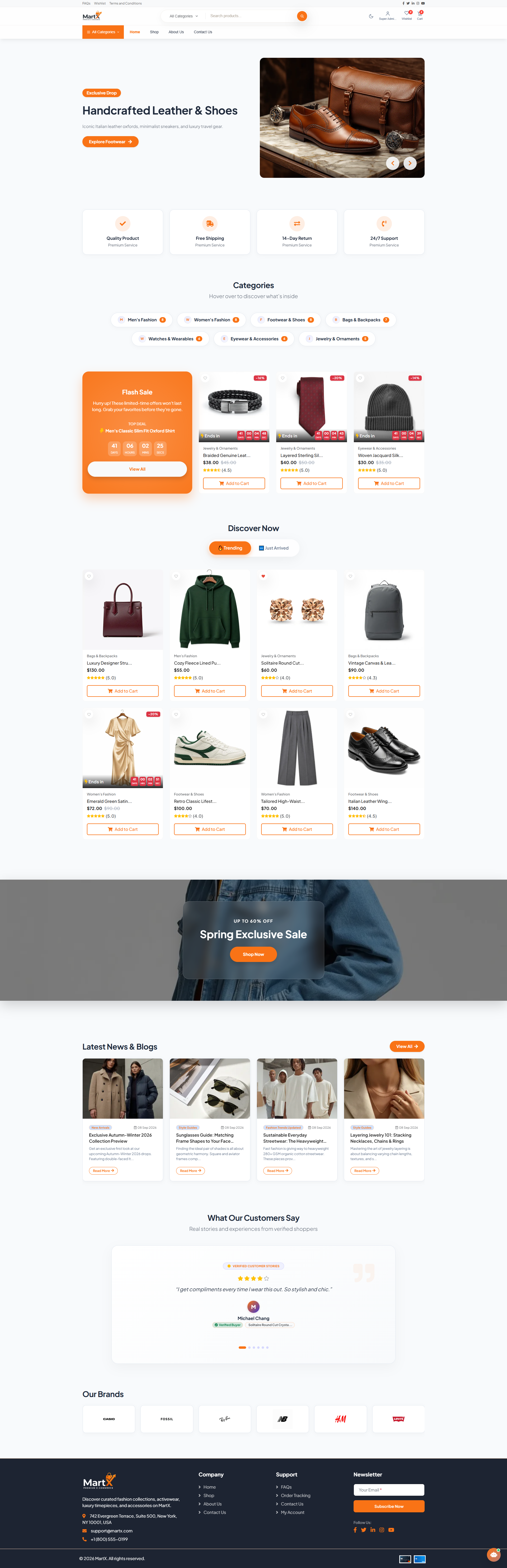
Home 2 Section Architecture:
- Split-screen hero with asymmetric promotional cards.
- Store Features strip (Shipping, Support, Guarantee).
- Interactive Category Showcase with hover-reveal tiles.
- Flash Sale section with "Top Deal" badge & countdown.
- Interactive "Discover Now" tab engine (Trending vs Just Arrived).
- "From The Journal" editorial blog slider.
- Curated partner brand logo carousel slider.
13.4 Tab 3: Home Page Content Builder (Context-Aware Dynamic Form Engine)
The Home Page Content Builder is a Context-Aware Dynamic System. Rather than forcing administrators to fill out irrelevant fields, MartX automatically detects whether Home 1 or Home 2 is currently active and renders a specialized, dedicated configuration form.
Inside Tab 3, an active badge indicates which layout you are configuring (e.g. Active: Home 1). You can click the "Switch Home Layout" button in the top-right corner to jump back to Tab 2 at any time.
Home 1 Content Configuration Form
Home 1 Active Form
Home 1 Field Breakdown & Live Frontend Mapping:
| Section | Field Label | Purpose / Where It Reflects |
|---|---|---|
| Categories | categories_title |
Main section heading above the category round slider. |
| Trendy Products | trending_title |
Heading for the high-engagement product grid. |
| Flash Sale | flash_sale_title |
Bold title next to the live countdown timer clock. |
flash_sale_btn_text |
Action button label linking to full deals catalog. | |
flash_sale_subtitle |
Urgency description paragraph below title. | |
| Just Arrived | latest_title |
Section title for new arrival catalog items. |
| Reviews | reviews_title |
Header for the verified customer reviews carousel. |
| Blogs | blogs_title |
Heading for the latest editorial stories & news. |
| Newsletter | subscribe_heading |
Call-to-action title for customer email capture. |
subscribe_text |
Descriptive incentive text for email subscription. |
Home 2 Content Configuration Form
Home 2 Active Form
Home 2 Field Breakdown & Live Frontend Mapping:
| Section | Field Label | Purpose / Where It Reflects |
|---|---|---|
| Store Features | features_subtitle |
Tagline displayed above service value cards. |
| Category Showcase | categories_title |
Main section title above interactive category cards. |
categories_subtitle |
Hover guidance subtitle for shopper engagement. | |
| Flash Sale | flash_sale_title |
Promotional title with emoji support (e.g. 🔥 FLASH SALE). |
flash_sale_badge |
Pill badge highlighting the deal level (e.g. Top Deal). | |
flash_sale_btn_text |
Call-to-action button text. | |
flash_sale_subtitle |
Urgency countdown description paragraph. | |
| Discover Products | discover_title |
Section title above multi-tab product filter engine. |
discover_trending_tab |
Custom tab button label (e.g. 🔥 Trending). | |
discover_latest_tab |
Custom tab button label (e.g. 🆕 Just Arrived). | |
| From The Journal | blogs_title |
Editorial journal stories heading. |
blogs_btn_text |
"View All" button text linking to blog archive. | |
| Our Brands | brands_title |
Section title above the partner brand logo carousel. |
13.5 Tab 4: Shop Page Layout Switcher (3 Styles)
The Shop Page is the primary product discovery and purchasing catalog of your store. MartX includes 3 distinct Shop Architectures to cater to varying inventory scopes, filter complexities, and customer browsing patterns.


13.6 Tab 5: Mega Menu Engine & Global Controls (2 Styles)
MartX includes an integrated Mega Menu Navigation Engine that elevates store categorization into an interactive, multi-tiered visual experience with promotional banner support.

Mega Menu Status Switch
A master toggle switch (Show Mega Menu in Header Navigation). When switched off, the categories dropdown is cleanly hidden from the header, streamlining the top bar for minimalist stores.
Mega Menu Button Title
Customizable trigger button text (default: All Categories). You can dynamically rename this to "Departments", "Shop Categories", or "Browse Store".
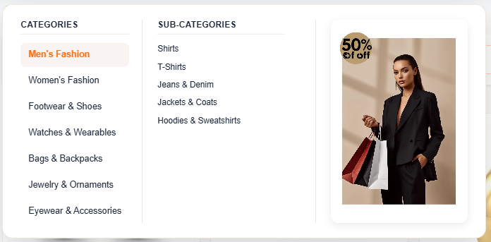
Mega Menu 1 Architecture:
Features a multi-tier navigation hierarchy. Primary categories appear in an organized vertical list on the left; hovering reveals subcategories in the center column, accompanied by a rich promotional image banner with call-to-action on the right.

To configure featured categories, upload promotional banners, set custom banner link destinations, and preview real-time simulators for Mega Menu 1 & 2, see Chapter 14: Navigation & Mega Menus (Section 14.8).
13.7 Tab 6: Product Card Engine (6 Architectural Styles)
The Product Card is the single most critical micro-conversion component of any e-commerce storefront. MartX features a Storewide 1-Click Product Card Engine offering 6 bespoke card architectures.
When you select a card style in Tab 6 and save, the change instantly updates every product display across your entire website: Home Page sections, Shop catalog, Category archives, Search results, Wishlist, and Related Products.

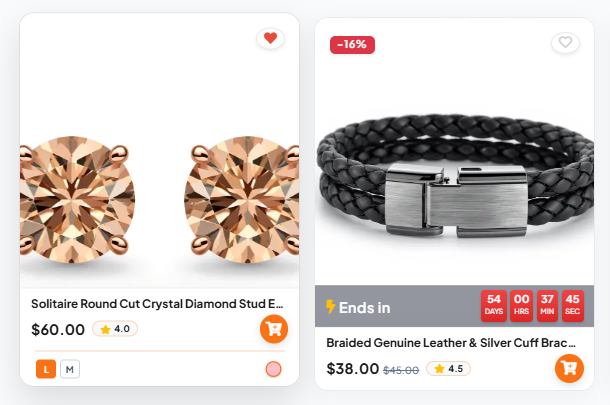
6 Architectural Card Styles (Dual State Breakdown):
Each mockup illustrates the dual visual behavior: the Left card shows the On-Hover Interactive State, and the Right card shows the Default View.



13.8 Live Preview Modal System & AJAX Persistence Engine
MartX is built to eliminate design guesswork. Every visual layout card in the theme manager is equipped with an integrated Live Preview Modal System (preview_modal.blade.php).
1. Inspecting Visual Layouts
Hovering over any card reveals the floating "Preview" button. Clicking it instantly launches a Bootstrap 5 modal rendering a full-scale, uncompressed screenshot of that specific layout in action.
Zero Commit Risk: Administrators can inspect headers, menus, and cards in crystal-clear fidelity before making any live changes to the active store.
2. Instant Persistence & Cache Management
When the administrator clicks "Save Theme Layouts", the changes are instantly synchronized in the background without reloading the page.
- Settings are securely saved and applied globally across the storefront.
- Storefront caches are automatically updated for immediate customer visibility.
- An interactive SweetAlert confirmation toast notifies the user of immediate activation.
13.9 Recommended Theme Combinations & UX Pairing Guide
To assist you in crafting the perfect brand persona, our UI/UX team has benchmarked the optimal layout combinations for popular e-commerce retail verticals:
| Store Type / Industry | Recommended Header | Recommended Home | Mega Menu | Shop Page | Product Card |
|---|---|---|---|---|---|
| Multi-Category Superstore Electronics, Gadgets & Groceries | Header 1 (Classic) | Home 1 (Marketplace) | Mega Menu 1 | Left Sidebar | Style 2 (Action Tray) |
| Fashion & Apparel Brand Clothing, Shoes & Accessories | Header 2 (Modern) | Home 2 (Split-Hero) | Mega Menu 2 | Right Sidebar | Style 5 (Rounded) |
| Luxury & Designer Boutique Jewelry, Perfumes & High Fashion | Header 3 (Curtain Menu) | Home 2 (Split-Hero) | N/A (Curtain Menu) | Full Width | Style 6 (Zoom & Overlay) |
| Beauty, Skincare & Health Cosmetics, Organic & Wellness | Header 2 (Modern) | Home 1 (Marketplace) | Mega Menu 2 | Left Sidebar | Style 3 (Minimalist) |
Regardless of the desktop layout combination you configure in the Theme Layouts Hub, MartX features an adaptive, mobile-first responsive architecture. On mobile and tablet viewports (< 992px), navigation transitions into a unified, high-performance offcanvas touch menu with bottom-sticky action bars for seamless cart and search reachability.